The Science Behind Perfect YouTube Thumbnail Fonts
When it comes to catching a viewer’s eye, YouTube Thumbnail Fonts can be the difference between getting a click or being ignored. Fonts are not just letters — they are a visual element that communicates mood, urgency, and style before a viewer even presses play. In this article, we’ll explore the importance of fonts for YouTube thumbnails, how to choose the best ones, and how tools like a YouTube thumbnail viewer and YouTube thumbnail backgrounds can help you stand out.
Why Fonts Matter in YouTube Thumbnails
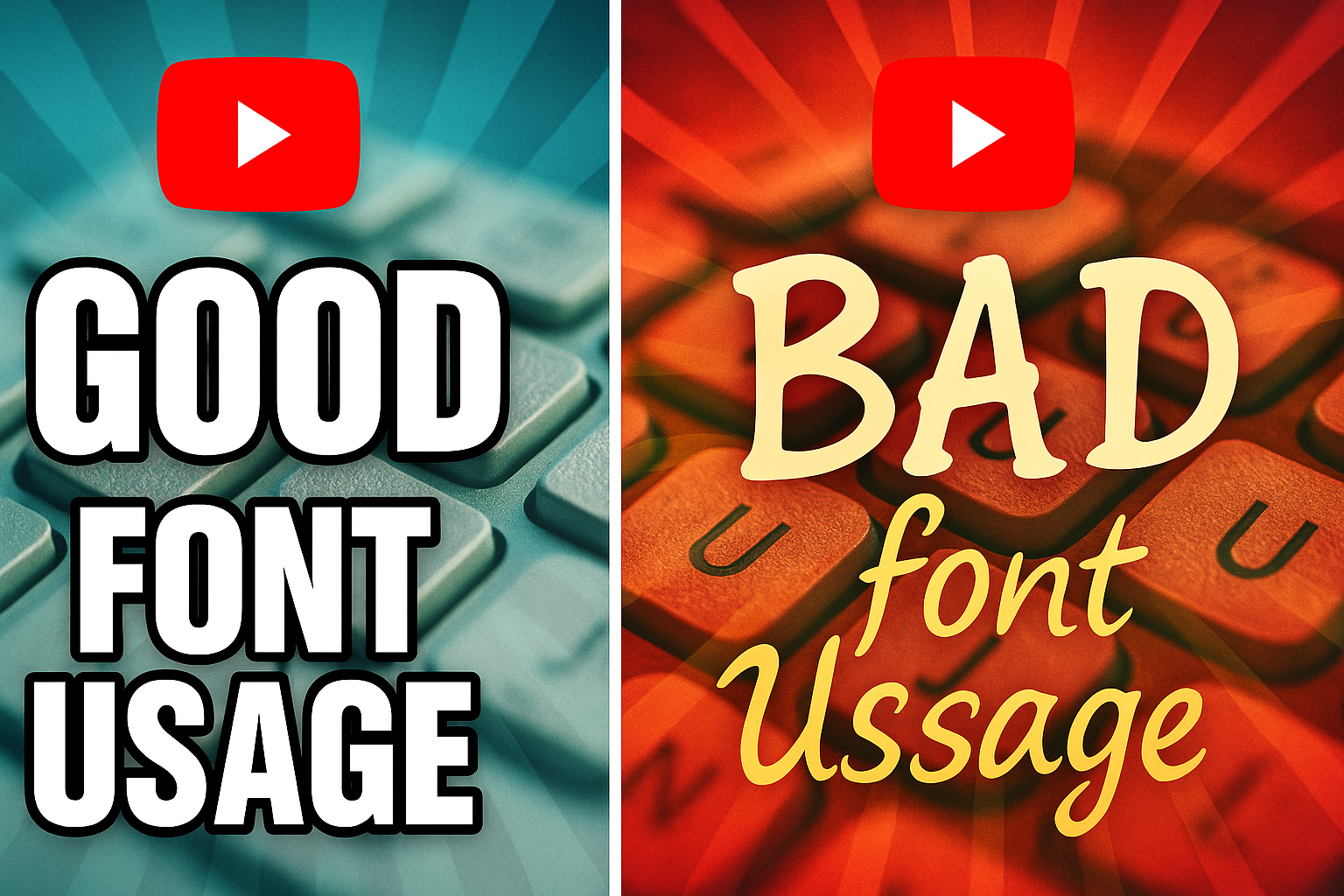
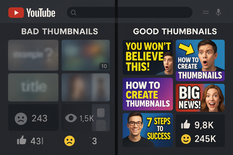
The right YouTube Thumbnail Fonts can instantly grab attention. Think of it this way: you’re scrolling through YouTube, and you search YouTube videos as words without thumbnails — the titles alone feel plain. But add an image with bold, readable text, and suddenly, the video becomes more appealing. Fonts not only enhance the look of your thumbnail but also set the tone for your content.
Choosing the Right Fonts for YouTube Thumbnails
Not all fonts are created equal. Some are designed for readability, while others are for style. The key is to balance both. Here’s what to consider:
- Bold & Readable: Even on small screens, your text should be clear.
- High Contrast: Use fonts that pop against your YouTube thumbnail backgrounds.
- Consistency: Stick to 1–2 font styles for brand identity.
Pro Tip: Test your design in a YouTube thumbnail viewer before uploading to see how it appears on different devices.
Best Practices for Using YouTube Thumbnail Fonts
- Keep Text Short – No more than 4–5 words to maintain impact.
- Use Keywords in Text – If your video is about a topic, make the thumbnail text match your title.
- Choose High-Impact Fonts – For example, Impact, Bebas Neue, or Anton are popular fonts for YouTube thumbnails.
- Experiment with Colors – Use contrast with your YouTube thumbnail backgrounds for better visibility.
Fonts That Work Best for Different Niches
- Tech Videos: Sleek, modern sans-serif fonts like Montserrat or Poppins.
- Travel Vlogs: Playful and casual fonts to match vibrant YouTube thumbnail backgrounds.
- Educational Content: Clean, professional fonts such as Lato or Open Sans.
- Entertainment & Gaming: Bold, dynamic fonts like Bangers or Luckiest Guy.
Testing and Previewing Your Thumbnails
Before finalizing, always check your design with a YouTube thumbnail viewer. This lets you see how the font and YouTube thumbnail backgrounds work together. If text blends into the background or becomes unreadable on mobile, adjust immediately.
Why Font Choice Impacts CTR
Click-through rate (CTR) is a major factor in YouTube rankings. The right YouTube Thumbnail Fonts can boost CTR by making your videos more enticing to click. Pairing readable fonts for YouTube thumbnails with eye-catching YouTube thumbnail backgrounds creates a winning formula.
Conclusion
Your font choice is more than just a design decision — it’s a strategic move that can impact how many people watch your videos. Using bold, readable YouTube Thumbnail Fonts, paired with the right YouTube thumbnail backgrounds, will help your videos stand out. Whether you’re using a YouTube thumbnail viewer to test your design or exploring new fonts for YouTube thumbnails, remember: clarity and style go hand in hand.

